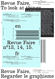
#13: A curatorial work: “Graphic Design in the White Cube” by Peter Bil'ak. Author: Lise Brosseau
In 2006, on the occasion of the 22nd Biennial of Brno, Peter Bil'ak proposed to 20 Graphic Designers and collectives to design posters for the exhibition that they were going to participate in: “Graphic Design in the White Cube”. These posters could then function on two levels: as the content for an exhibition (the newly created collection would be presented, accompanied by the sketches that led to the creation of the different posters) and in the streets of the city where the posters would be hung in order to promote and provide information about the event. With this invitation, the designer/curator wished to respond to the idea that the exhibition space isolates Graphic Design creations from the real world, from context (commercial, cultural, historic) and from the function that is necessary for reading and understanding them. He thus chose to make the conditions of the exhibition space (in this case the Moravian Gallery) the context for the creations, and to exhibit the work of Graphic Designers rather than objects.
This strategy, which doesn't hide its self-referential nature, was accompanied by an essay, written by Bil'ak himself; a text that continues to be regularly cited when the question of approaching the exhibition of Graphic Design as a subject arises. Our study will engage the analysis of this latter in order to question the characteristically theoretical approach of this project. It will attempt to place the reflexive, discursive approach and the editorial part of this curatorial proposition within the recent history of Graphic Design. It will also try to show how the positions taken will lead to a form of redefinition of Graphic Design.
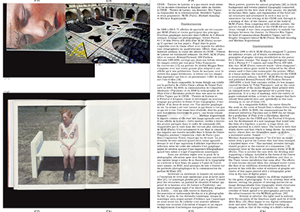
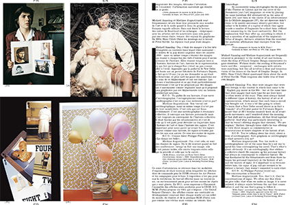
#14: A series of posters: CDDB Théâtre de Lorient by M/M Paris. Author: Étienne Hervy.
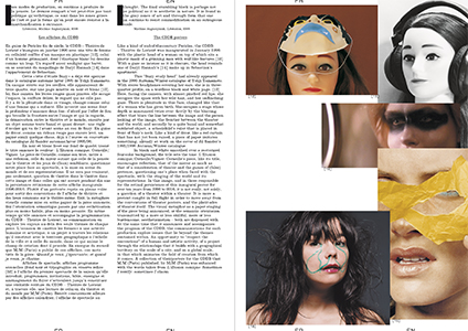
The poster, more particularly the event poster, is a building block in the identity of French Graphic Design, in the way it organizes itself, presents itself, and states itself. However, despite being developed over 15 years by one of the major Graphic Design studios with a reputation that has been established on an international scale, the work of M/M (Paris) for the CDDB (Centre Dramatique de Bretagne) Théâtre of Lorient has largely not been examined in relation to this tradition.
The posters made by M/M (Paris) for the CDDB are remarkable on more than one level: the timescale of the work, for one, along with the consistency of its principles (black and white text related to a photograph reproduced in four colors), and the power of the relationship that exists between Graphic Designers and their client, CDDB director Eric Vigner. If that is not enough, one can also highlight the critical dimension of these posters, as much in relation to theatre as Graphic Design, while also emphasizing their singularity and their innovative character, in direct rupture with the habits of the French cultural poster.
We could continue to argue over the necessity of dealing one-by-one with the points raised by this work, but we prefer to look at it as the unpublished journal of M/M (Paris) that speaks about them, their work, and the world. “But it is not like surfers who advocate 'surf' culture. We are not advocating a Graphic Design culture” (M/M (Paris)). Commissioned by, and an integral part of, the CDDB project, these posters are intimately linked to the career of M/M (Paris), and they contain numerous fragments from it: voyages and busy places, steps along their route, traces of other projects, such as catalogues by Yohji Yamamoto, or a collaboration with Björk who, photographed during the making of the cover for her
Vespertine album, became, with photographer
Inez van Lamsweerde, the protagonist of
Duras'
Savannah Bay. It will therefore be necessary to follow the trail laid by these clues, and to propose a reading of it.
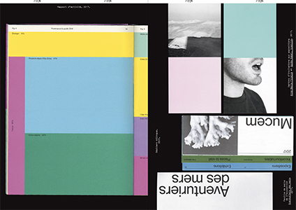
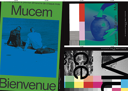
#15: The work done everyday: the Mucem. Authors: Manon Bruet and Thomas Petitjean.
Though many Graphic designers write about their projects or their practice, it seems that this is often
a priori, in the context of a statement of intent associated with a call for offers for example, or
a posteriori, to provide commentary for their production. First we think and do, then we formulate in order to show others, we explain, we justify. This is finally one of things at stake in our profession. In fact, most of the time emphasis is placed on a context, a discourse or a result. Ultimately, we rarely speak of “during”, of the moment of “doing”, probably because it consists more of discussions—sometimes even negotiations—and mail exchanges, than of design itself. This is what interests us here. This issue, with its different voices, has been created in two stages. First, we will look at our “studio” work within Spassky Fischer for the communication and identity of the Mucem of Marseille (Musée des civilizations de l'Europe et de la Méditerranée). Rather than explaining the approach or choices of the Graphic Designers, it is our intention to take a look, intentionally devoid of hindsight, at a project that we work on every day. To speak about its ambition, its evolution and development due to the contact with the different participants from the museum, of our place as designers in the face of a cultural institution such as this.
During the second stage, we will question other designers on their experiences in similar contexts: Mirko Borsche, Studio Dumbar, Okrm and Strobo among others. An opportunity to provide a wider view of the day to day activity of the discipline.
Faire is a bi-monthly magazine dedicated to
graphic design, published from October to June, distributed issue by issue or in the form of anthologies of three or four issues. Created by
Empire,
Syndicat studio's publishing house,
Faire is aimed for undergraduate students as well as researchers and professionals, documenting contemporary and international practices of graphic design, along with the history and grammar of styles. Each issue focuses on a single subject, addressed by a renowned author. Adopting an analytical and critical posture with regard to the forms and activities of graphic design, editors Sacha Léopold and François Havegeer have been running this print magazine since 2018, working with a growing list of authors (
Mathias Augustyniak,
Stuart Bertolotti-Bailey, Lise Brosseau, Manon Bruet,
Thierry Chancogne, Céline Chazalviel,
Jérôme Dupeyrat, Aude Fellay, Catherine Guiral, Étienne Hervy, James Langdon, Olivier Lebrun, Victoire Le Bars,
Alexandra Midal, Camille Pageard,
Remi Parcollet,
Sonia de Puineuf, Simon Renaud, Benjamin Thorel, Rica Cerbarano...), resulting in unique and varied topics and writing styles.

