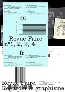
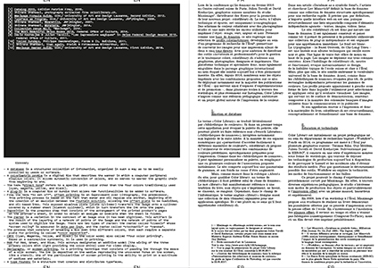
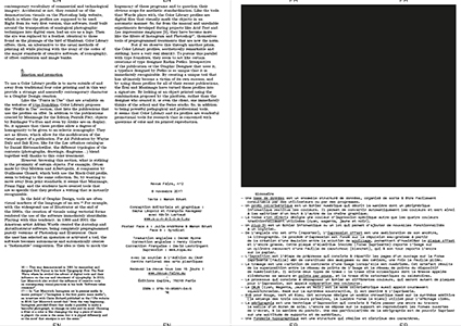
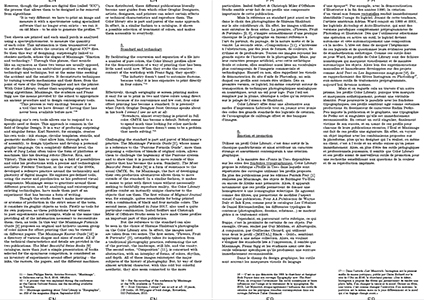
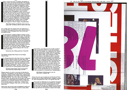
The first four issues of the critical review dedicated to the analysis of Graphic design, published by Empire books (studio
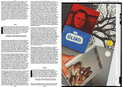
Syndicat). Each publication documents a specific object, addressed by a renowned author: the Rouge-gorge series at Éditions Cent pages by S.P. Millot; the database colorlibrary.ch by studio Maximage; the monograph
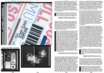
Recollected Work by Mevis & Van Deursen; and the invitation cards by the artist
Stanley Brouwn.
#01:
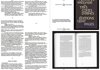
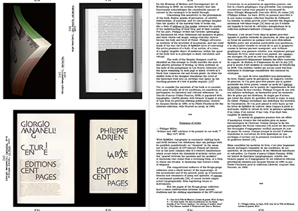
A collection – Rouge-gorge, Éditions Cent pages by S.P. Millot. Author:
Thierry Chancogne.
“SpMillot, who form a couple both in life and in work, met in the 1980s while studying at the
School of Decorative Arts […]. SpMillot design posters, websites, brochures, and logotypes. However, the couple do seem to have a penchant for typography. A typeface should not be understood only in its "microscopic" approach, on the scale of the letter. SpMillot do not so much design characters as systematically adapt them by changing a glyph here, an x-height there, adjusting them to the needs of a specific project, to their own grammar. […] In considering the work of SpMillot, we will concern ourselves with what is doubtlessly one of their most well-known and perhaps most representative works: the Rouge-gorge collection of the éditions Cent pages.”
Thierry Chancogne
#02:
A technical platform – Colorlibrary.ch by Maximage. Author: Manon Bruet.
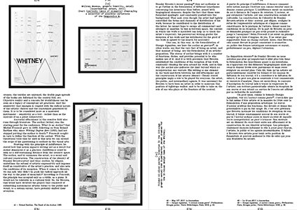
The Workflow research project, run by Tatiana Rhis, Guy Meldem, and Julien Tavelli and David Keshavjee (Maximage) at the
ECAL, is interested in current technologies of the printed object. It consists of a series of experiences that attempt to circumvent currently available production technologies, provoking coincidences and accidents with the goal of obtaining new outcomes. One of the first results of the Workflow programme has been the creation of a series of colorimetric profiles that allows the conversion of digital images for printing with one, two, three, four, or five accompanying colors, whether they are basic (CMYK), pastels, fluorescent, or metallic. Advocating an “innovative” and “professional” solution for the treatment of color, the ECAL and the Workflow programme launched the website colorlibrary.ch in 2016 and offered the profiles for sale. The platform appears as an online library that presents a large variety of profiles with different colorful combinations.
#03:
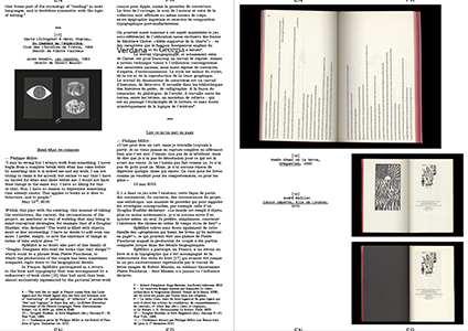
A monograph – Recollected Work by Mevis & Van Deursen. Author: Étienne Hervy.
In 2006, the publisher Artimo entrusted Linda van Deursen and Armand Mevis with the editorial direction and the Graphic Design of their own monograph,
Recollected Works. Joined by Paul Elliman in writing the texts, the two Graphic Designers responded with an approach similar to that which they adopt when they accompany other artists and photographers in the creation of books whose relevance has largely contributed to the studio's reputation. Mevis and van Deursen propose to the reader to experience their work in operation, rather than simply contenting themselves with the reproduction of the work presented as artworks in themselves. Rather than the nostalgia for a more or less formalized organization of their previous projects, the two Graphic Designers look at their previous work as the material for an autonomous project from which this book will emerge.
#04:
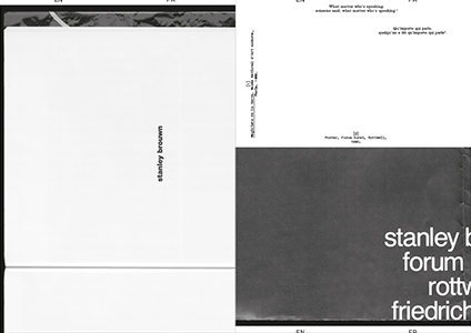
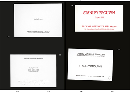
A communication – invitation cards by the artist Stanley Brouwn. Author: Céline Chazalviel.
Behind the standards put in place for the communication related to his exhibitions—the use of lowercase and Helvetica exclusively, the refusal to reproduce images of his work, to produce (or allow production of) written commentary on the subject of the same work, to appear in the context of a vernissage or even to answer an interview—the artist Stanley Brouwn builds his identity by way of ellipses. Since his participation in documenta 5 (1972), the stories linked to this attitude have come to draw the outlines of an artistic posture that goes beyond any one particular case. The invitation cards for his solo exhibitions provide a symptomatic example: set almost exclusively in Helvetica, the absence of uppercase, flying in the face of the graphic identity of the gallery or the host institution, they seem impossible to date, give or take twenty years. This mastery reveals that graphic and typographic choices represent one of the spaces of neutrality built by Brouwn, like other artists and theoreticians of his generation, and generations that came after.
Faire is a bi-monthly magazine dedicated to
graphic design, published from October to June, distributed issue by issue or in the form of anthologies of three or four issues. Created by
Empire,
Syndicat studio's publishing house,
Faire is aimed for undergraduate students as well as researchers and professionals, documenting contemporary and international practices of graphic design, along with the history and grammar of styles. Each issue focuses on a single subject, addressed by a renowned author. Adopting an analytical and critical posture with regard to the forms and activities of graphic design, editors Sacha Léopold and François Havegeer have been running this print magazine since 2018, working with a growing list of authors (
Mathias Augustyniak,
Stuart Bertolotti-Bailey, Lise Brosseau, Manon Bruet,
Thierry Chancogne, Céline Chazalviel,
Jérôme Dupeyrat, Aude Fellay, Catherine Guiral, Étienne Hervy, James Langdon, Olivier Lebrun, Victoire Le Bars,
Alexandra Midal, Camille Pageard,
Remi Parcollet,
Sonia de Puineuf, Simon Renaud, Benjamin Thorel, Rica Cerbarano...), resulting in unique and varied topics and writing styles.

